Text-on-Image Ads: The Meta Creative Format Working Right Now
A text-on-image ad is a picture where the words are part of the scene: a road sign, a note on a desk, a message on a screen. Facebook used to limit text to 20 percent of an ad image and stopped enforcing that in September 2020, so these ads now look like ordinary posts. They are cheap to make, especially with AI image tools, and they let you test messages quickly: keep the picture and change the words.
Vary one ingredient at a time, check them on a phone, and judge them on sales, not clicks.
The ad format that used to be banned
For years there was one rule every Facebook advertiser knew. Do not put too many words on your picture.
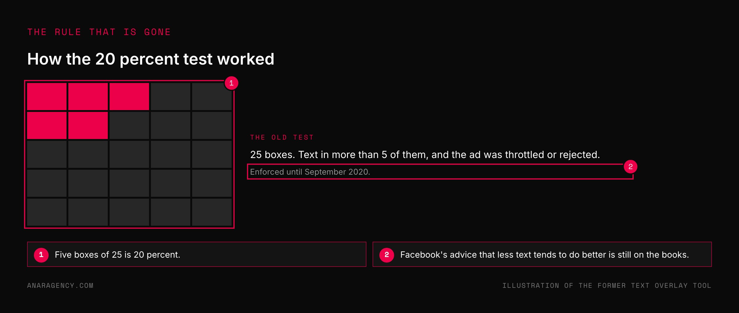
The limit was 20 percent of the image. Facebook had a little tool with a grid on it. You uploaded your ad, counted the boxes with text in them, and if there were too many, the ad was throttled or rejected.
So a whole generation of ads looked the same: a clean photo, and all the words pushed down into the caption.
Then, in September 2020, Facebook dropped it. Its statement said it would no longer penalize ads with higher amounts of text in auctions and delivery.
In the same breath it added that images with less than 20 percent text generally perform better. That part is worth remembering. The rule went away.
The advice did not.
Why a picture of a sign works now
Open any feed and look at what your friends post. Screenshots of notes. Photos of signs.
A quote on a plain background. Words on pictures are how people talk to each other now.
So an ad that is a picture of a handwritten note does not look like an ad. It looks like the thing above it and the thing below it.
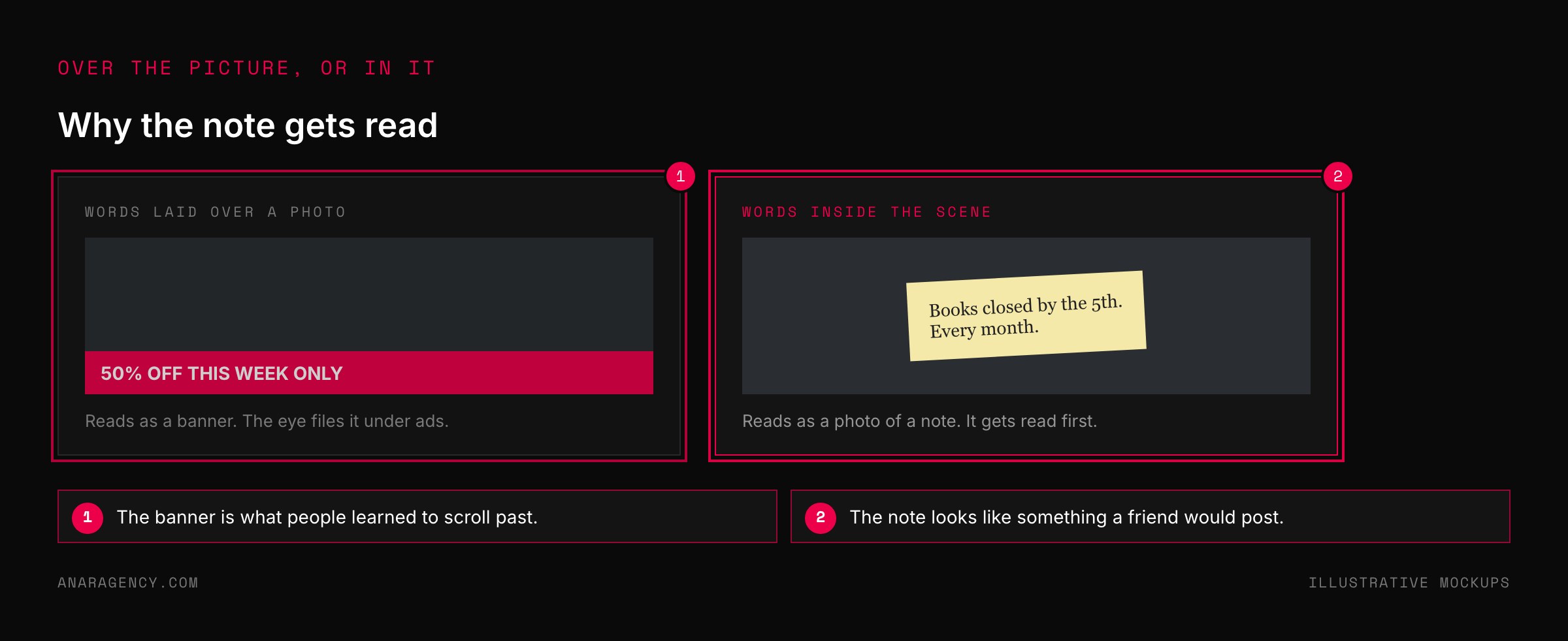
That is the whole mechanism. The words are not laid over the image like a banner. They are in the scene: painted on a wall, written on a sticky note, lit up on a billboard.
The reader's eye treats it as a photo first and reads it before deciding it is an ad.
And there is a practical reason these have taken off. They are cheap. An AI image tool can make a believable photo of a note on a desk in a minute, and changing the words takes one more.
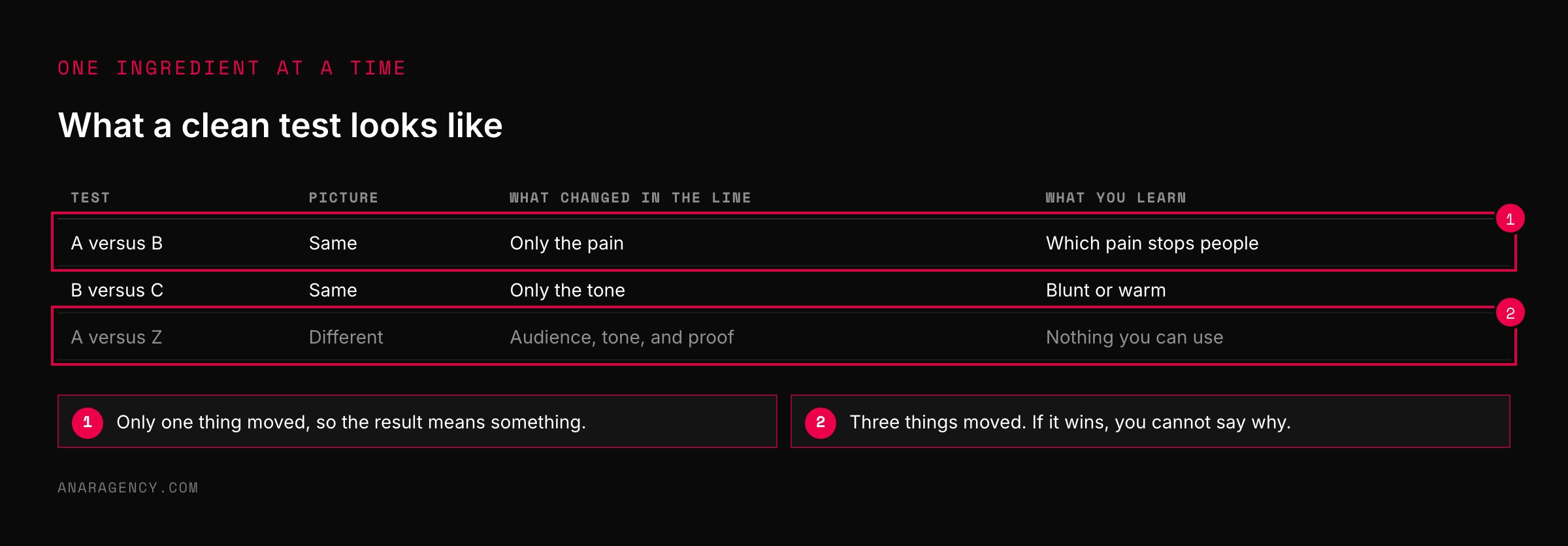
A text-on-image ad has two parts: the scene and the line. Lock the scene. Then vary the line one ingredient at a time: who it is for, the pain, the outcome, the objection, the proof, the tone.
Write thirty candidate lines before opening an image tool. Generate the picture without words and set the type afterward. Run a few scenes that look clearly different from each other alongside the word swaps.
Check every ad on a phone, and keep or kill it on sales.
Quick Changers: how the best accounts use the format
Some advertisers get twenty usable tests out of one afternoon with this format. They are not making twenty pictures. They do three things.
We call them Quick Changers.
They lock the picture and change the words. Once a scene looks right, they keep it and swap only the line on the sign. That makes each test a clean test of the message, because nothing else moved.
They also make pictures that look nothing alike. Meta's engineers described a system built to handle what they called exponential growth in ad creatives. Our read is that twenty near-identical images act like one.
So alongside the word swaps, they run a few scenes that are really different: a road sign, a phone screen, a note.
They write the lines before they open the tool. Thirty candidate lines in a document first. Then the session with the image tool is typing, not thinking.
We work the same way on our own images. The photo is generated without any words in it, and the type is set afterward in a design tool. AI still gets letters wrong, and a designer's type is sharper than anything the model draws.
It also means a line can be fixed in ten seconds without making a new picture.
The Ingredient List
If you are only changing the words, you need a way to change them on purpose. Otherwise you write the same line six ways and learn nothing.
Think of the line on the sign as a recipe. It has ingredients, and you can swap one at a time.
Who it is for. The pain. The outcome.
The objection. The proof. The tone.
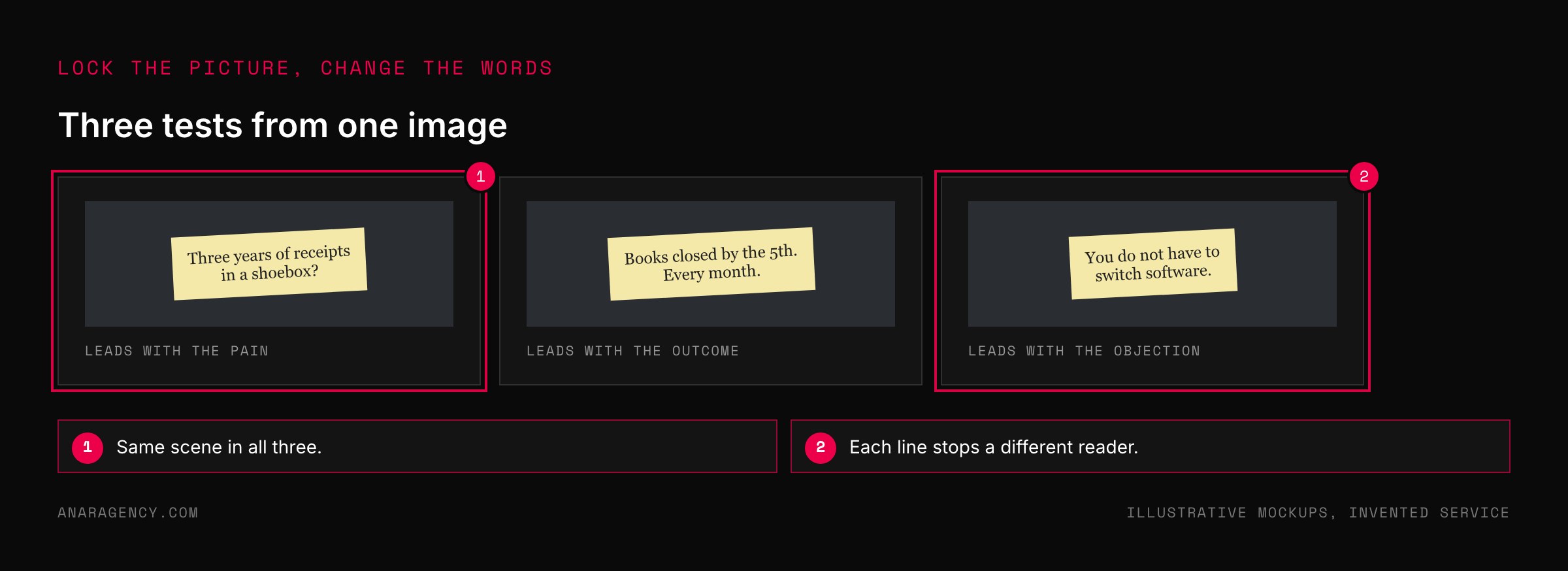
Take a bookkeeping service. "Three years of receipts in a shoebox?" leads with the pain. "Books closed by the 5th, every month" leads with the outcome.
"You do not have to switch software" leads with the objection.
Same service, same picture, three different readers stopped.
Change one ingredient per test. If you change the audience and the tone and the proof all at once and it wins, you will not know which one did the work. For which kind of line to lead with in a feed, see before-words and after-words.
"AI images look fake and will get my account flagged."
You may be worried about two things here: that people can tell, and that the platform will punish you. Both deserve a straight answer.
On the first, a picture of a sign is the easiest thing for these tools to get right. There is no face to look strange and no hands to count. The usual giveaway is garbled lettering, which is exactly why we add the words ourselves.
On the second, Meta has said publicly how it handles AI-made media. It labels content when it detects industry-standard AI signals or when people disclose it. Its stated approach is to add labels and context instead of removing content for being AI-made.
So do not try to hide it. If a label appears, it appears. An honest sign with a true line on it has nothing to fear from a small tag.
What will get an ad rejected is the same thing that always did. Meta's policy does not allow ads that assert personal attributes of the viewer, and a sign that reads "Still in debt?" breaks it just as surely as a caption would.
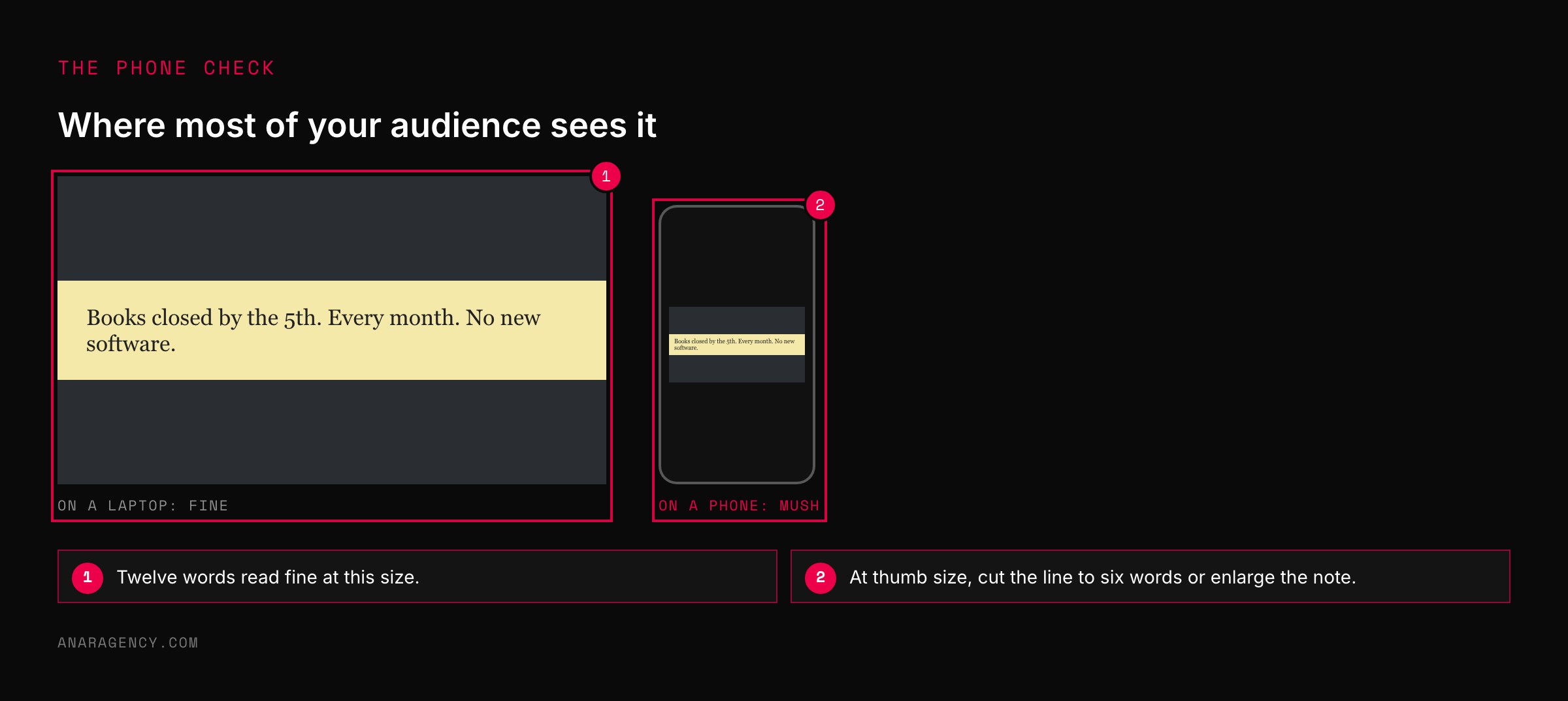
Three more checks before you publish. Look at it on a phone, because a line that reads fine on a laptop can be mush at thumb size. Keep the words clear of the areas Meta's interface covers in Stories and Reels.
And do not fake things that are not signs: no invented customer quotes and no made-up news headlines.
What to read next, and why
Facebook Removes the 20% Text Limit on Ad Images (news): The moment the rule ended, with Facebook's statement. Note the sentence that says less text still tends to do better.
Our Approach to Labeling AI-Generated Content (Meta announcement): What Meta labels and why. Read it once so the label never surprises you.
About text overlays and the safe zone for ads in Stories and Reels (Meta documentation): Where the app's own buttons sit, so your line is not hidden behind them.
Microsoft Clarity (free tool): Recordings of what visitors do after the click. If a sign ad gets clicks and no sales, this is where you find out why.
So the simple takeaway is this: make one good picture of a sign, then stop making pictures. Change the words, one ingredient at a time, and let the sales tell you which line was right.
Questions executives ask
Does Facebook still have a 20 percent text rule for ad images?
No. Facebook stopped enforcing the 20 percent limit in September 2020 and said it would no longer penalize ads with higher amounts of text. It also said images with less than 20 percent text generally perform better, so the limit is gone but the advice remains.
What is a text-on-image ad?
A static image ad where the words are part of the picture itself, such as a road sign, a handwritten note, a billboard, or a message on a screen. Because people post text on images all the time, these ads look like ordinary content in a feed.
Can I use AI-generated images in Meta ads?
Yes. Meta has said it labels AI-generated content when it detects industry-standard signals or when people disclose it, and that its approach is to add labels and context. The ad still has to follow every other advertising policy, including the rule against asserting personal attributes.
How do I test ad creative quickly?
Hold the picture constant and change only the words, one ingredient at a time: the audience, the pain, the outcome, the objection, the proof, or the tone. Each version is then a clean test of the message. Run a few clearly different scenes alongside so the ads are not all near-duplicates.
What is a good click-through rate for a Meta image ad?
As a working rule of thumb we look for about 1 percent, and for about 85 percent of link clicks to reach a loaded landing page. Treat both as checks for finding what is broken. The number that decides whether an ad stays is sales.

Filip Kovacevic is the founder of Anar Agency in Phoenix. He spent five years running SEO, Meta ads, email, and content for medical practices across the United States, and now does the same work for healthcare, home-service, legal, and professional-service businesses, alongside AI implementation. More from Filip →
Talk it through in 15 minutes
Bring one AI question from this article. We will tell you what we would do, whether or not you hire us.
Book a 15-Min Chat →