Ad-to-Page Alignment: Match the Visitor's State, Not the Headline
An ad does two things to the person who clicks it. It makes a promise, and it puts them in a state. Most landing pages get checked against the promise, which is why the headline usually matches.
Few get checked against the state, which is why the first screen so often answers a question the visitor was not asking. A skeptical visitor needs proof before an outcome. A hopeful one needs the outcome before the proof.
A confused one needs a sort before either. Read the four elements of your ad the way a scroller does, name the state they add up to, and build the top of the page to answer it. Then let scroll depth tell you which part of the page to fix next.
Message match is the easy half
Every conversion checklist says the landing page must match the ad: same offer, same claim, same words in the headline. That is correct, and it is table stakes.
Google's own Quality Score documentation grades landing page experience on relevance to the ad and the keyword, and a mismatch raises what you pay per click before it costs you a single conversion. So match the promise. Then keep going, because the promise is only half of what your ad did.
The other half is emotional. By the time someone taps, your ad has already made them feel something specific: stuck, doubtful, hopeful, afraid, curious, rushed, confused, or relieved that somebody finally said it. They carry that feeling onto the page, and your first screen either meets it or ignores it.
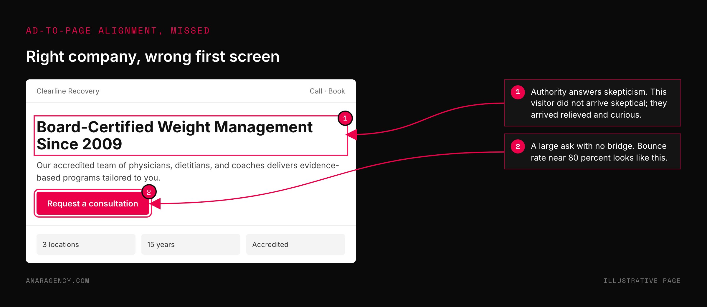
A page that answers hope with a wall of credentials, or answers skepticism with a glossy outcome, has matched the headline and lost the visitor. We see it in accounts every month. The copy aligns, the bounce rate is still near 80 percent, and nobody can say why.
So the question is not "does the page say what the ad said." It is "does the first screen answer the state the ad created." To answer that, you have to read your ad the way a scroller does.
How a scroller reads an ad: four elements, two impressions
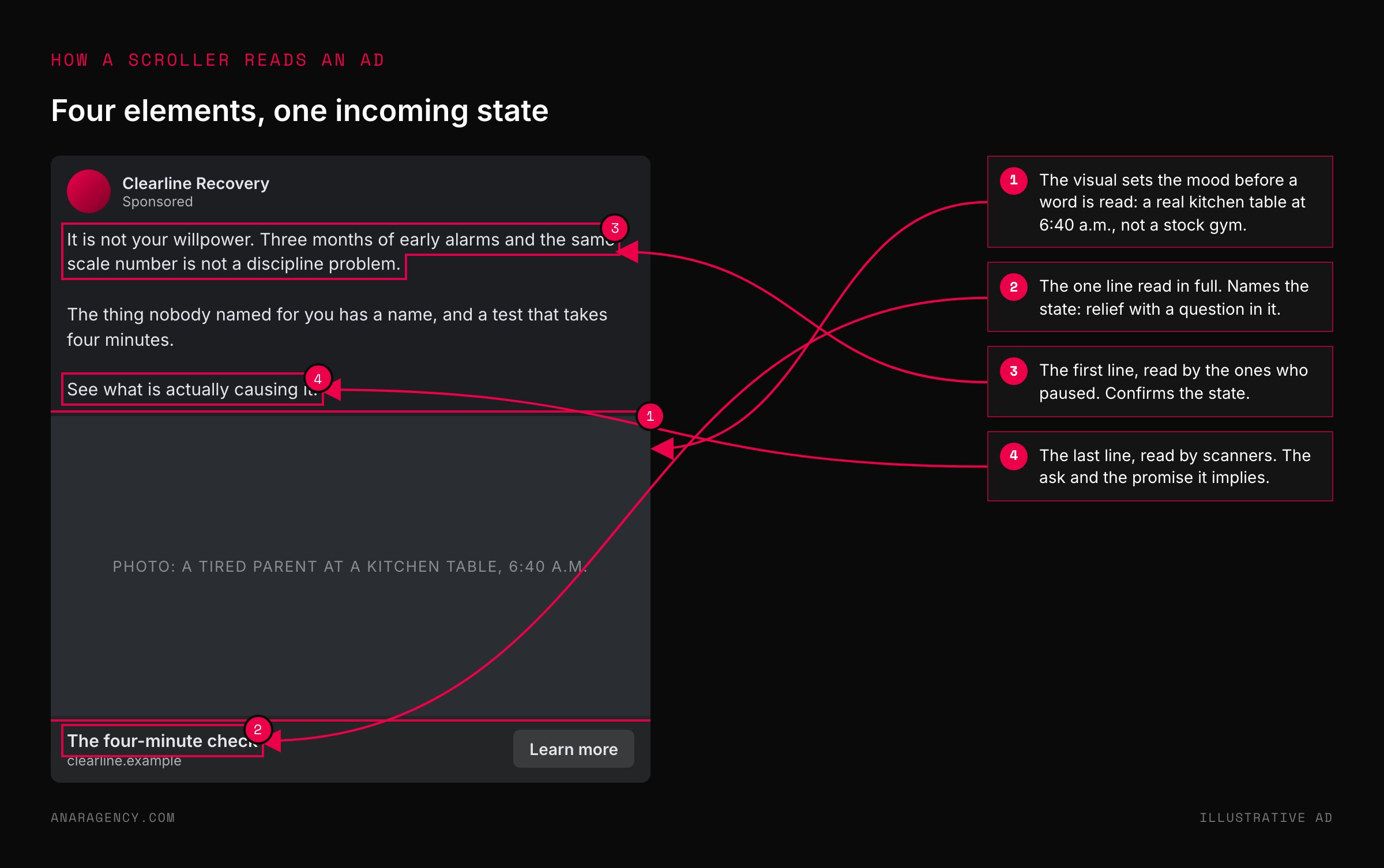
In a feed, almost nobody reads an ad top to bottom. They take four things, in order. The visual, which stops the thumb and sets a mood.
The headline, which is the one line read in full. The first line of the copy, read by the ones who paused. And the last line, read by scanners who jump to the end for the ask.
First and last dominate. Decades of eyetracking from the Nielsen Norman Group describe the same behavior on web pages: people scan, and the first words of the first lines get the attention.
Those four elements add up to one incoming state, usually a dominant one and a secondary one. A photo of an exhausted parent, a headline that says "it is not your willpower," a first line that names the symptom, and a last line that says "see what is actually causing it" create relief first and curiosity second.
A headline with a number, a first line with a guarantee, and a last line that says "read the reviews" create skepticism being answered. That is a completely different arrival.
Write it down. For each of the three ads sending the most traffic to a page, list the four elements and the state they create as a split, something like 70 percent hope, 30 percent skepticism. That one page of notes is the brief for everything above the fold, and it will do more for you than any amount of headline brainstorming.
Read your top three ads as a scroller does: visual, headline, first line, last line. Name the state they create as a dominant and a secondary share. Build the first screen of the page to answer that state before it asks for anything: proof for skepticism, outcome for hope, risk reversal for fear, a sort for confusion, the mechanism for curiosity, speed for urgency, empathy for pain, mirrored words for relief.
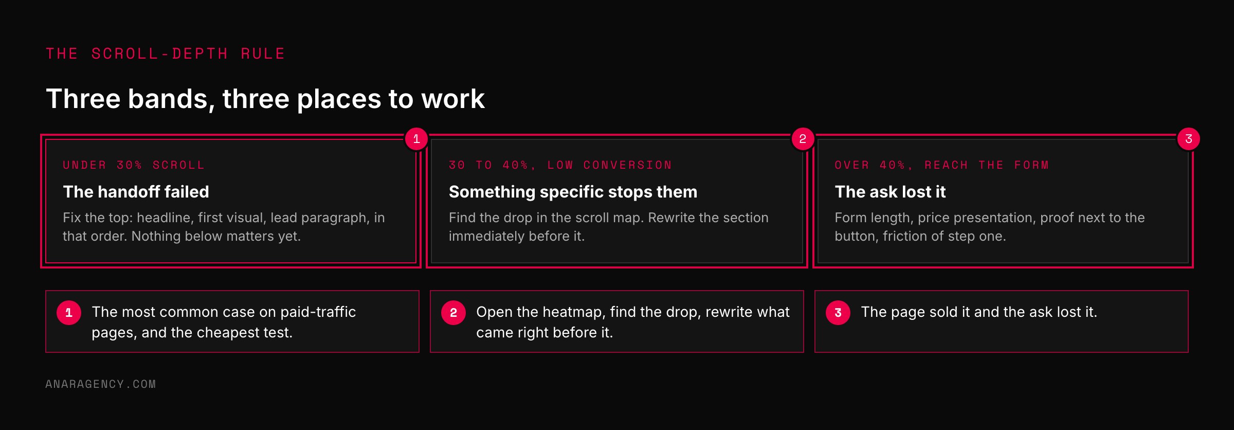
Then use scroll depth to decide what to fix: under 30 percent, fix the top; 30 to 40, fix the section before the drop; over 40, fix the ask.
The State Match Grid: eight states and what each one needs first
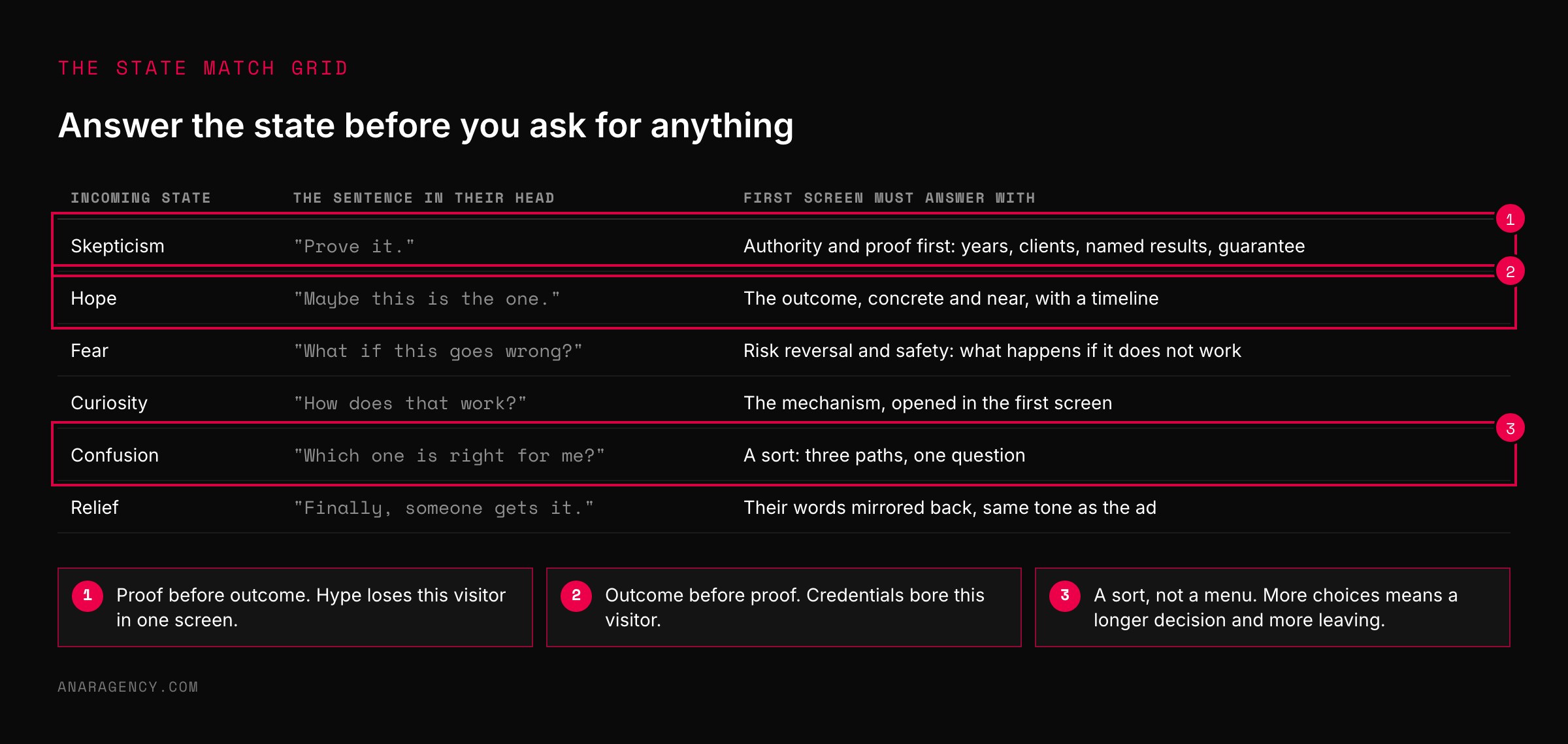
The grid in the figure above pairs each incoming state with the response your first screen owes it.
Pain needs a short agitation and then the way out, led by empathy. Skepticism needs authority and proof before anything else: years, clients, named results, a guarantee, in plain language, because the visitor has been burned and is reading for a reason to leave. Fear needs risk reversal and a clear answer to "what happens if this does not work."
Hope needs the outcome, concrete and close, with a timeline. Curiosity needs the mechanism opened in the first screen so the scroll finishes the thought. Urgency needs speed and availability.
Confusion needs a sort: three paths and one question. Relief needs the visitor's own words mirrored back, in the tone they arrived with.
Two rules make the grid work. The response has to be the first thing on the page, not the third section, because a mismatched first screen never earns the scroll. And the response has to be proportional: a page for a 70/30 hope-and-skepticism ad leads with outcome and follows right away with proof, not the reverse.
Reordering two blocks above the fold is the cheapest test in conversion work. It is often the largest too.
There is a research reason this matters. Working memory is small. A page that forces the visitor to re-orient, to work out what this page is about and whether it is for them, spends that capacity on orientation instead of persuasion.
Cognitive load is the technical name. The practical version is that the first screen should confirm, not surprise. The same logic sits under Hick's law: the more choices presented at once, the longer the decision, which is why a confused visitor needs a sort and not a menu.
"I'm stuck."
"Prove it."
"What if this goes wrong?"
"Maybe this is the one."
"How does that work?"
"I need this now."
"Which one is right for me?"
"Finally, someone gets it."
Above the fold is the handoff, not the close
The first screen has one job: earn the scroll.
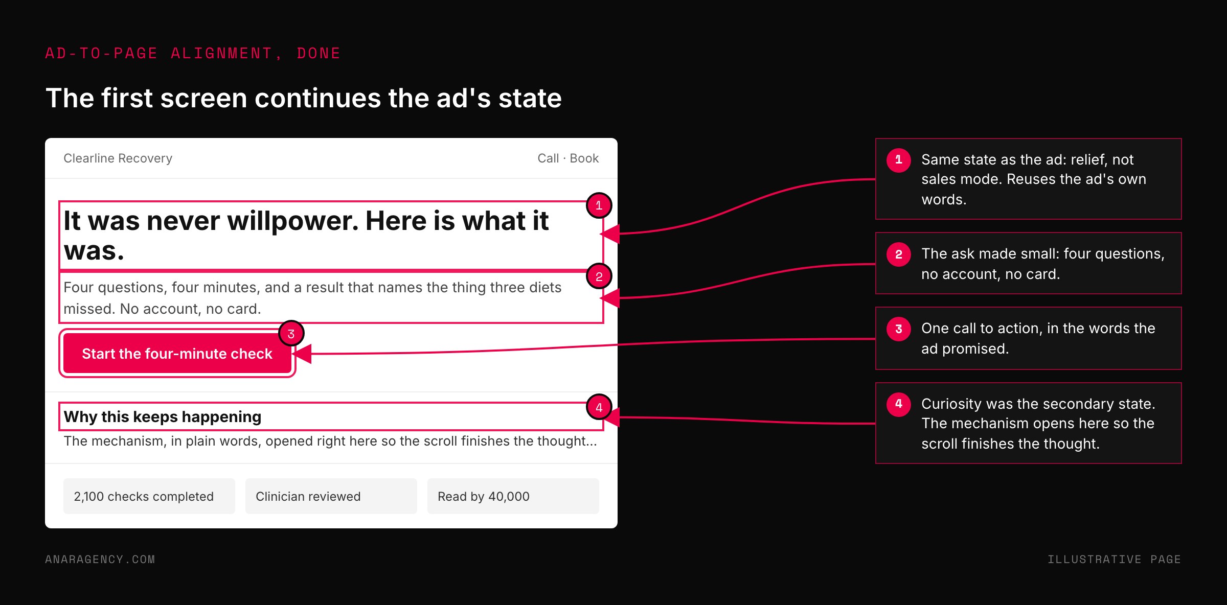
It is not where the sale happens, and pages that try to close in the hero tend to lose the visitor who needed one more screen of context. Treat the top of the page as the last frame of the ad. It confirms they landed in the right place, answers the state, and gives a reason to keep reading.
The form, the price, and the full proof stack come later, in the order the state calls for.
That is also why page speed belongs in this conversation. A visitor arriving in urgency or curiosity who waits three seconds for a hero image arrives in a different state than the one your ad created.
Google's page experience guidance and the Core Web Vitals thresholds give you the numbers. The alignment reason to care is that a slow first screen breaks the handoff before the headline can do its work.
One more thing has to carry above the fold: the picture. If the ad was a photo of a real person at a kitchen table, a hero of a stock skyline tells the visitor they clicked into a different company. Reuse the ad's image or its closest sibling.
The visitor should not be able to tell where the ad ended and the page began.
Scroll depth tells you what to fix
Conversion rate alone cannot tell you which part of a page is failing. Scroll depth can.
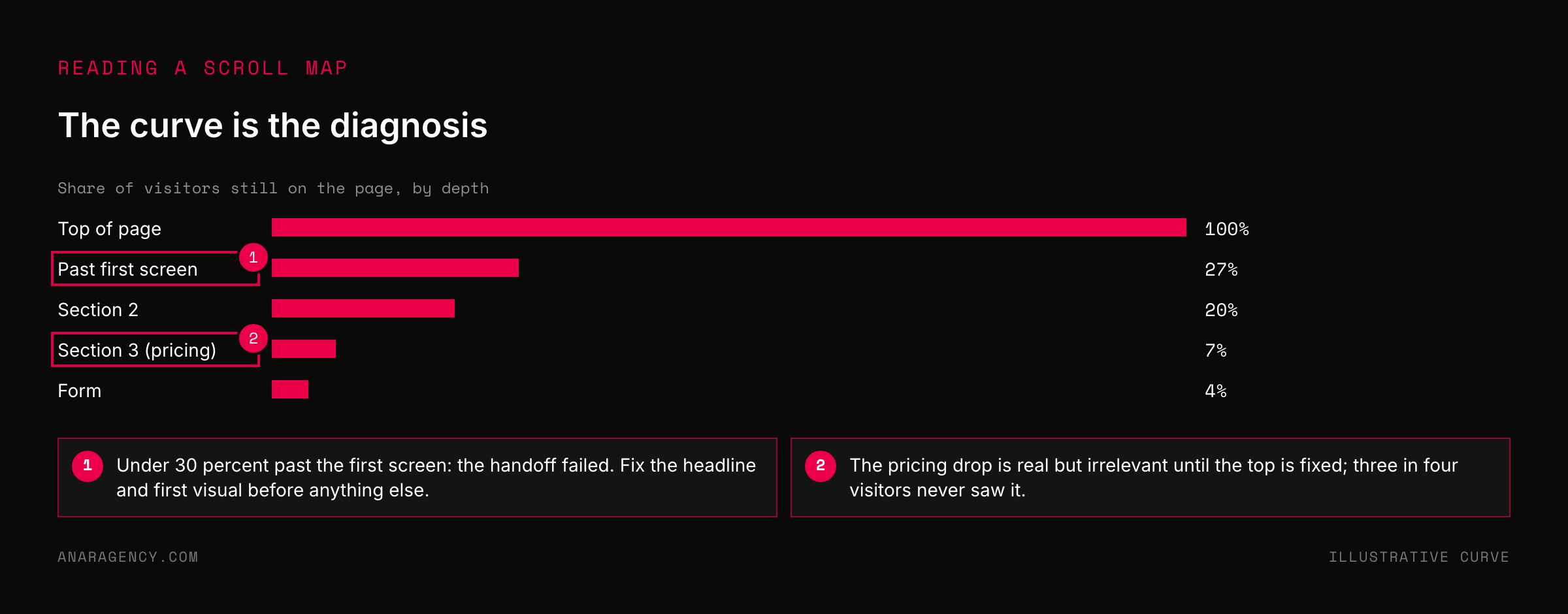
Tools like Microsoft Clarity's heatmaps, which are free, show what share of visitors reach each point on the page. The shape of that curve is a diagnosis.
If fewer than about 30 percent of visitors scroll past the first screen, the handoff failed. The ad created a state the page did not answer, or the headline did not confirm the promise, or the page loaded slowly. Everything below the fold is irrelevant until that number moves, so the test belongs at the top: the headline, the first visual, the lead paragraph, in that order.
If 30 to 40 percent scroll and conversion still lags, the page is holding attention and then losing it somewhere specific. Find the point where the curve drops and rewrite the section right before it, because that is the section that failed to meet expectations.
If more than 40 percent reach the form or the buy box and still leave, the page sold the idea and the ask lost the sale: the form length, the price presentation, the proof next to the button.
Pair scroll depth with engagement rate in Google Analytics, which counts sessions that lasted ten seconds, had a conversion, or had two or more page views. A page with high engagement and low scroll is a page people read carefully and then stop. A page with low engagement is a page people leave before reading.
Those are different problems with different fixes. The two numbers together tell them apart in a minute.
Testing without confusing yourself
Run one major test at a time on a page. A new headline and a new price in the same week give you a result nobody can attribute, because whatever the visitor meets first changes how they read everything after it.
Pick the test the scroll curve points to. Run it for at least a full week so weekday and weekend traffic both count. Read it on the metric that matches its position on the page: scroll past the fold for a top-of-page test, reach-the-form for a middle test, completion for a form test.
Do not build a separate page for every ad. Build one when an ad represents a truly different concept, say an "is this a scam" ad next to an educational "do this instead" ad, because those arrive in different states and need different first screens.
Ads that vary the hook on the same concept can share a page, and a dynamic headline that echoes the ad's words covers most of the remaining gap. Google's responsive search ads already assemble headlines per query. The page should meet them with the same flexibility, not with a new build per variant.
And when traffic is thin, stack proof instead of waiting for significance. A page getting 200 visitors a week will not settle a headline test quickly, but a skeptical audience will respond to three pieces of proof per claim where one would not register.
Watch the secondary signals, scroll, form starts, click-throughs, and let them guide the next change while the primary number catches up. Baymard's research on abandonment and form length is a reminder of how much is lost at the ask itself. That is where a page that has done everything else right still has the most to gain.
Questions executives ask
What is ad-to-landing-page alignment?
Matching the landing page to both what the ad promised and the state it put the visitor in. The promise match is the headline and offer. The state match is whether the first screen answers the feeling the ad created: proof for a skeptical visitor, the outcome for a hopeful one, a way to choose for a confused one.
Why is my landing page not converting when the copy matches the ad?
Usually because the first screen answers the wrong state. The words match but the order is wrong for the visitor who arrives: credentials shown to someone who came in hopeful, or an outcome shown to someone who came in skeptical. Check scroll depth; if under 30 percent, the top of the page is the problem.
What scroll depth is good for a landing page?
Under about 30 percent of visitors scrolling past the first screen means the handoff from the ad failed. Thirty to 40 percent with low conversion points to a specific section losing people. Over 40 percent reaching the form means the page sold it and the ask is losing it.
Should I build a different landing page for every ad?
Only when the ad is a genuinely different concept that creates a different state. Ads that vary the hook on the same idea can share a page, ideally with a headline that echoes the ad's words. One page per concept, not one per ad.
How long should I run a landing page test?
At least a full week so weekday and weekend behavior both count, and only one major change at a time. Judge the test on the metric that matches its position on the page, not only on final conversions.

Filip Kovacevic is the founder of Anar Agency in Phoenix. He spent five years running SEO, Meta ads, email, and content for medical practices across the United States, and now does the same work for healthcare, home-service, legal, and professional-service businesses, alongside AI implementation. More from Filip →
Talk it through in 15 minutes
Bring one AI question from this article. We will tell you what we would do, whether or not you hire us.
Book a 15-Min Chat →