Checkout CRO: Fixes That Lift Earnings Per Session
A checkout has two levers: how many people finish, and how much each spends. Improve both by removing surprise and doubt. Show the full cost early, let people buy without creating an account, keep trust signals and the guarantee visible, ask only for what you need, and make the page feel like the same place the buyer just came from.
Place any add-on offer where it does not interrupt payment. Measure completion rate and average order together as earnings per session, because a change that lifts one often lowers the other.
The three hundred million dollar button
A large online retailer had a simple form between the shopping cart and the checkout. Two fields, two buttons, one link.
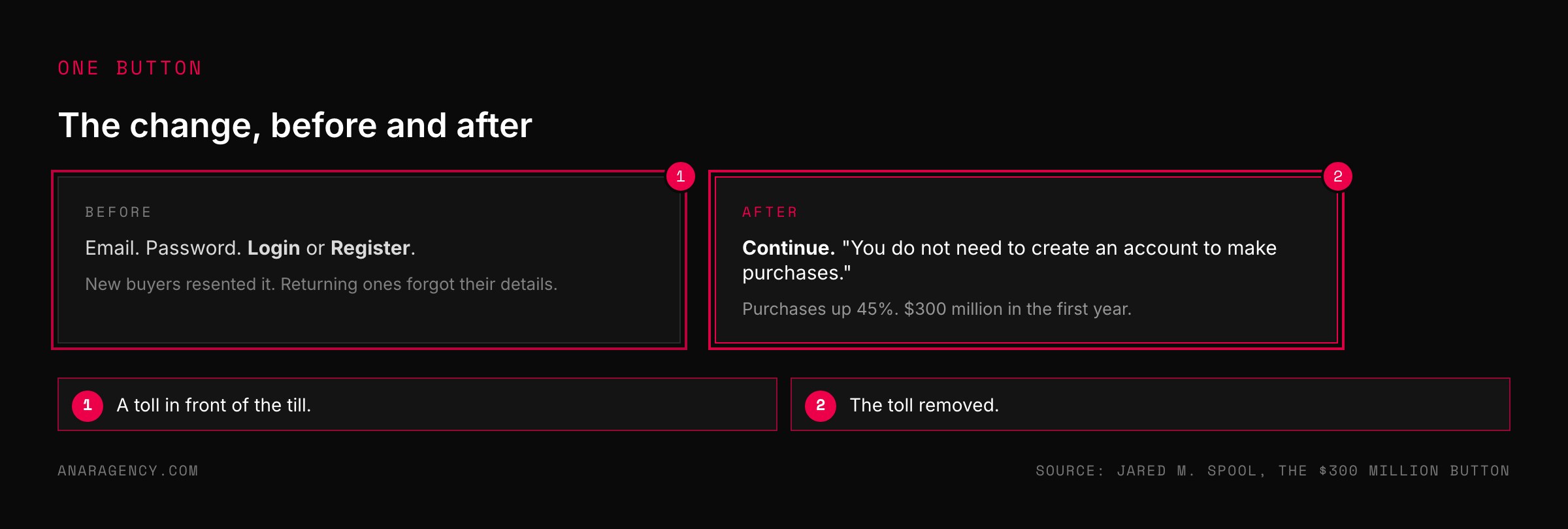
The fields were for an email address and a password. The buttons said Login and Register. The designers believed they were helping returning customers go faster.
A usability consultant, Jared Spool, watched real shoppers use it. First-time buyers resented being asked to register. Returning buyers could not remember which email they had used.
So the team removed the Register button. In its place they put a button that said Continue, with one sentence saying no account was needed to buy.
The number of customers completing a purchase rose by 45 percent. That was worth an extra 15 million dollars in the first month and 300 million in the first year.
Where carts are lost
That story is two decades old. The pattern is still current.
A research firm, Baymard Institute, has collected 50 studies of how often online shopping carts are abandoned. The average across them is 70.22 percent.
Many of those people were only browsing. Baymard asked the rest why they left.
The leading answer, at 40 percent, was extra costs: shipping, tax, and fees that appeared late. Then slow delivery at 20 percent, not trusting the site with card details at 19, being made to create an account at 18, and a checkout that was too long or complicated at 17.
Almost none of that is about the product. The buyer had decided. Something on the last page changed their mind.
Baymard's own estimate is that a large site can gain about 35 percent in conversion from better checkout design alone. That is their figure for large retailers, not a promise for yours.
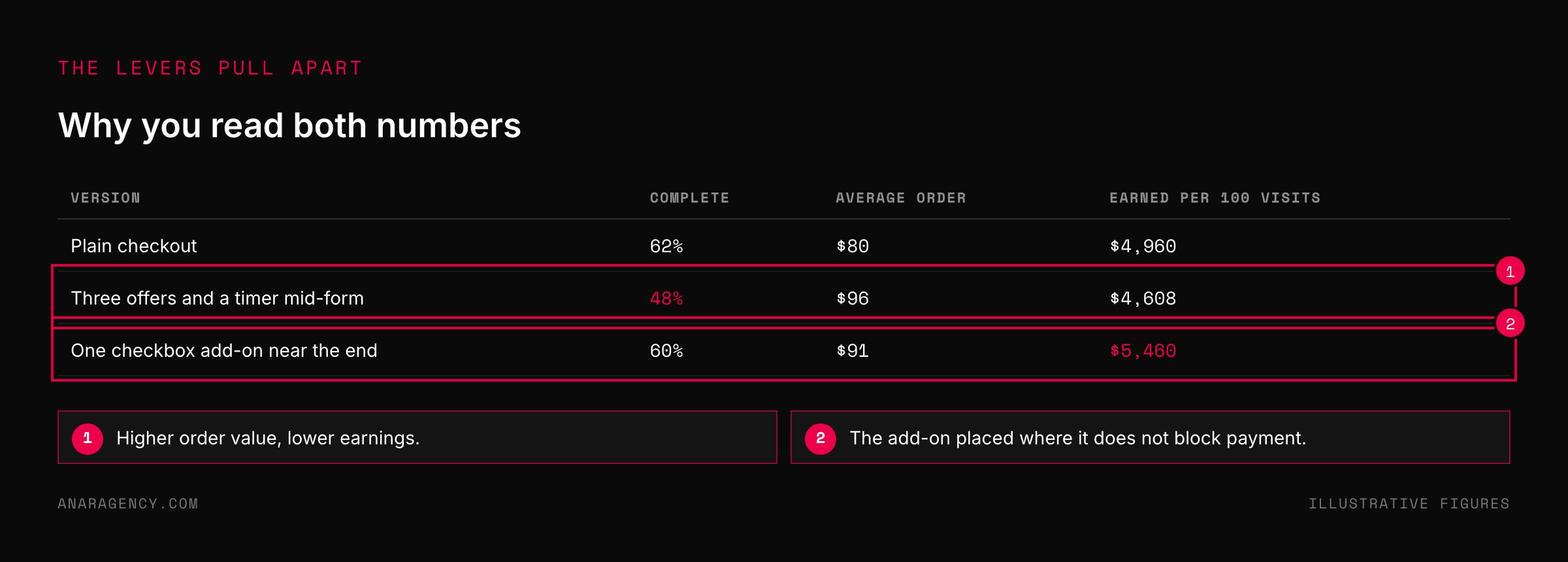
A checkout has two levers: the share of visitors who complete it and the average amount they spend. Their product is earnings per checkout session, and most changes raise one while lowering the other, so read both. Fix surprise and doubt first: show full cost early, allow guest purchase, keep trust signals and the guarantee visible, cut fields, place add-ons where they do not block payment, and repeat the name, price, and promise from the previous page.
A booking form is a checkout. Never hide fees or fake urgency.
The Two-Lever Diagnostic
Before changing anything, know what you are trying to move. A checkout has two levers.
Lever one is completion. Of the people who reach the checkout, what share finish?
Lever two is order value. What does the average finisher spend, including anything added on the way through?
Multiply them and you have what each visit to the checkout earns. We call that reading the Two-Lever Diagnostic, and it is a special case of earnings per session.
The reason to read both is that they pull against each other. Add an offer to the checkout and order value rises while completion often falls. Strip the page bare and completion rises while order value falls.
A team watching one number will keep making the other worse. Record both for two weeks before you touch the page, so you know which lever is the weak one.
Clear-Path Builders: what a good checkout does
The checkouts that convert well are not clever. They are free of surprises. We call the people who build them Clear-Path Builders.
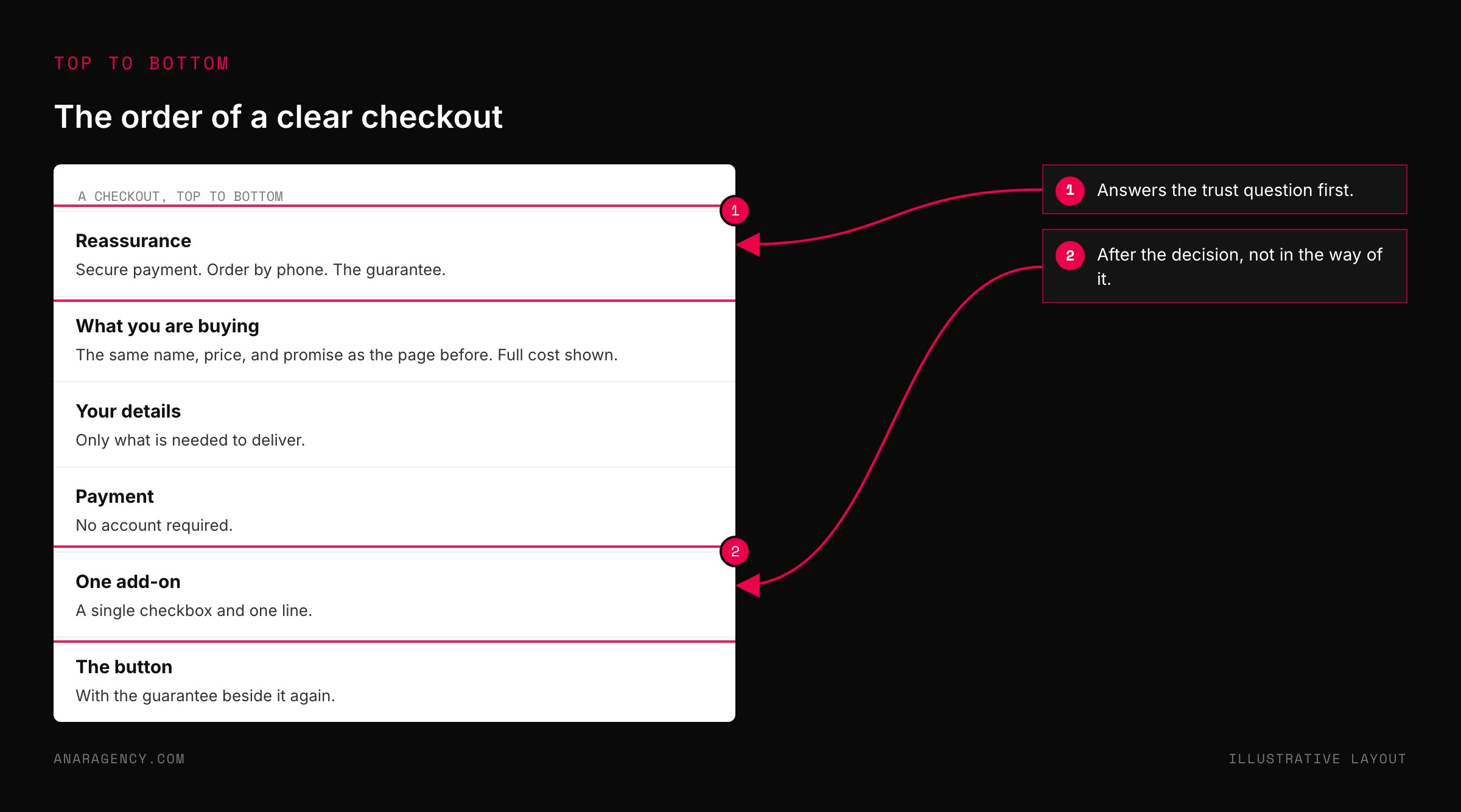
They show the full cost early. Shipping and tax appear before the last step, not on it. The top reason for leaving is a total that jumped.
They let people buy as a guest. Offer an account after the purchase, when it is a convenience instead of a toll.
They keep reassurance in view. A secure-payment note, a way to order by phone, and the guarantee near the top and again by the button. Nearly one in five leavers did not trust the site with a card.
They ask for less. Every field is a small decision, and decisions wear people down, an effect known as decision fatigue. Remove any field you do not need to fulfil the order.
They place the add-on with care. An extra offer belongs where it does not sit between the buyer and the pay button: one checkbox, one line, near the end. A stack of offers and timers is a list of reasons to reconsider.
They keep it the same place. The checkout repeats the name, price, and promise from the page before. If the ad felt like one book and the checkout like another, the buyer is lost.
See ad-to-page alignment.
"I sell a service. I do not have a checkout."
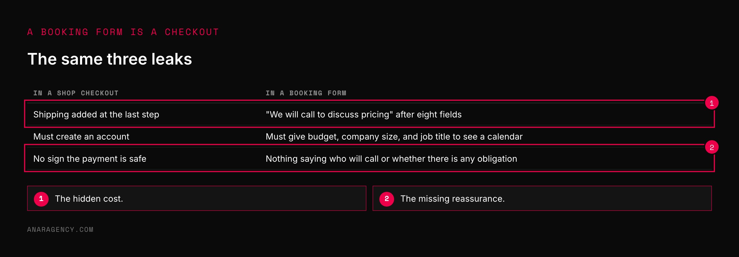
You may take bookings or enquiries and think this is for shops. Your booking form is a checkout. The same things lose people.
A surprise at the last step. "We will call you to discuss pricing" after someone has filled in eight fields is a hidden cost.
Forced effort. A form that wants a company size, a budget, and a job title before it will show a calendar is a forced account.
No reassurance. Nothing saying what happens next, who will call, or whether there is any obligation.
So run the same diagnostic. Of the people who open the booking form, how many finish? And how many of those are worth a call?
Those are your two levers, and the trade between them is covered in qualify before the call.
Whatever you sell, keep one rule. Prices, fees, and terms must be stated truthfully. A checkout that hides a charge until the end is the leading cause of abandonment, and a fake countdown timer is a false claim.
What to read next, and why
The $300 Million Button (article by Jared Spool): The original account. Four minutes, and the best case ever made for watching real users.
Cart abandonment rate statistics (Baymard Institute): The averaged studies and the survey of reasons, updated regularly.
Decision fatigue (encyclopedia entry): Why each extra field and choice costs you buyers.
Advertising FAQs: A Guide for Small Business (FTC guide): The rules on stating prices and terms.
So the simple takeaway is this: buy your own product, or book your own call, on a phone. Write down every moment you hesitated. Each one is costing you customers.
Questions executives ask
How do I improve checkout conversion rate?
Remove surprises and reasons to doubt. Show shipping, tax, and fees before the final step, allow purchase without creating an account, display security and guarantee information, reduce the number of fields, and keep the page consistent with the one before it.
What is the average cart abandonment rate?
Baymard Institute's average across 50 studies is 70.22 percent. Many abandoners were only browsing. Among the rest, the most common reason given is extra costs such as shipping, tax, and fees.
Where should an order bump go on a checkout page?
Where it does not stand between the buyer and the payment button. A single checkbox with one line of explanation near the end of the form adds order value with less risk to completion than several offers placed mid-flow.
What is the $300 million button?
A case reported by usability consultant Jared Spool in which a retailer replaced a Register button at checkout with a Continue button and a note that no account was needed. Completed purchases rose 45 percent, worth an additional 300 million dollars in the first year.
Should I measure checkout by conversion rate or revenue?
Both, together. Completion rate times average order value gives earnings per checkout session. Changes that raise one often lower the other, so judging on a single figure can lead you to keep a version that earns less.

Filip Kovacevic is the founder of Anar Agency in Phoenix. He spent five years running SEO, Meta ads, email, and content for medical practices across the United States, and now does the same work for healthcare, home-service, legal, and professional-service businesses, alongside AI implementation. More from Filip →
Talk it through in 15 minutes
Bring one AI question from this article. We will tell you what we would do, whether or not you hire us.
Book a 15-Min Chat →