Quiz Funnels That Make the Visitor Feel the Problem
A quiz funnel works for one reason most builders miss: it changes the visitor while it sorts them. Eight to ten questions, arranged so the first few are easy and flattering, the middle few are about the situation, and the last few ask the visitor to recognize themselves, produce a person who has admitted, click by click, that the problem is theirs and that what they tried did not work. The result page then names the finding, makes its cost concrete, explains why past attempts failed, and offers one of three or four paths that fits.
The visitor arrives at the offer already agreeing with the diagnosis. That is why a well-built quiz converts cold traffic that a landing page cannot, and why a quiz that merely asks "which of these are you" does not.
Two kinds of quiz, one of which works
The common quiz funnel is a sorter. It asks a few questions, assigns the visitor to a bucket, and shows the bucket's offer.
It converts a little better than a plain page because it feels personal, and a little worse than people hope, because the visitor is the same person at the end that they were at the start. They were curious. They are still curious.
The quiz that works is a consultation. A good consultant does not open with the diagnosis. They ask what you want, what you have tried, how long it has been, what you have told yourself about it, and by the time they say what they think, you have already said most of it.
The questions did the persuading. The diagnosis only confirmed what you admitted on the way there.
Build your quiz as that consultation and three things change. Cold traffic that would never read a long page will answer nine questions. The visitor arrives at the offer having stated the problem in their own clicks.
And the result page can be short, because it does not have to convince anyone of anything they have not already said.
The question arc: easy, situational, honest
The structure is an arc with three movements.
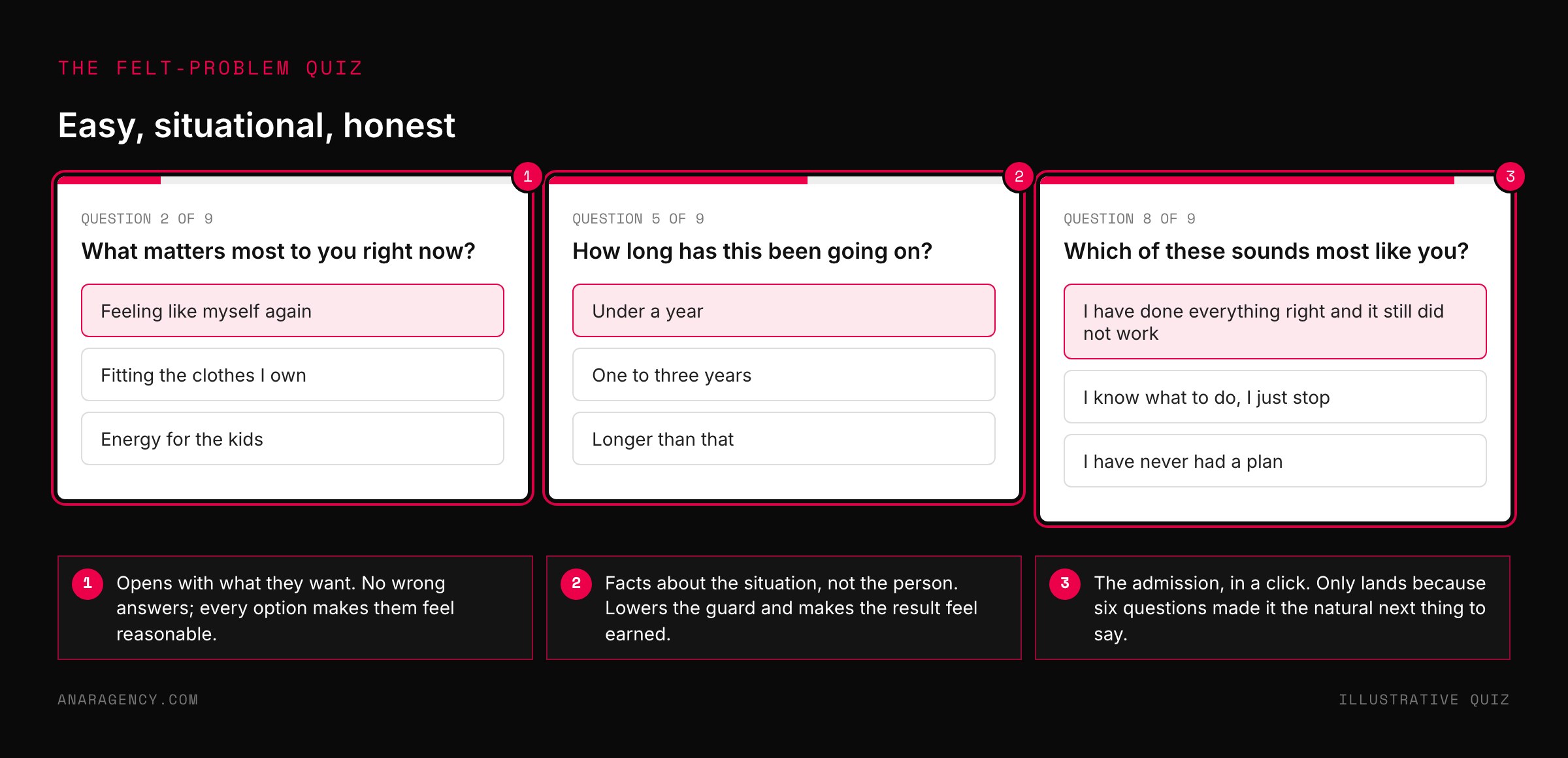
The first three questions are easy and flattering: what they want, what they have tried, what matters most to them. Multiple choice, no wrong answers, each option written so that choosing it makes the visitor feel reasonable. The visitor gets something before they give anything, which is the opposite of a form.
The middle three or four questions are situational. How long has this been going on, how often, what is the setting, what else is in the picture. These are facts about circumstances, not about the person, and they are the sorting questions that make the result feel earned.
They also lower the guard, because nobody feels judged by a question about timing.
The last three questions turn inward. Which of these sounds like you. What have you told yourself about why it has not worked.
How does it feel when the usual approach fails again. Here the visitor says, in a click, that the problem is theirs and that the previous attempts did not fix it.
That admission is the whole point of the arc. It only lands because the first six questions made it feel like the natural next thing to say, not an accusation.
Eight to ten questions is the working range. Fewer and there is no room for the arc. More and the completion rate falls.
Keep a visible progress bar, because an unfinished task has a pull of its own, a pattern documented since the 1920s as the Zeigarnik effect, and a bar at 70 percent is harder to abandon than a blank form.
Eight to ten questions in three movements: easy and flattering, situational and neutral, then identity and admission. A visible progress bar. A result page that names the finding, makes its cost concrete from the answers, explains why past attempts failed, and offers one of three or four paths that fits.
No gate before the result. Every question one a competent professional would ask; every result true given the answers.
Why the arc changes people
The mechanism is not a trick, and it helps to know which parts of the psychology literature it leans on.
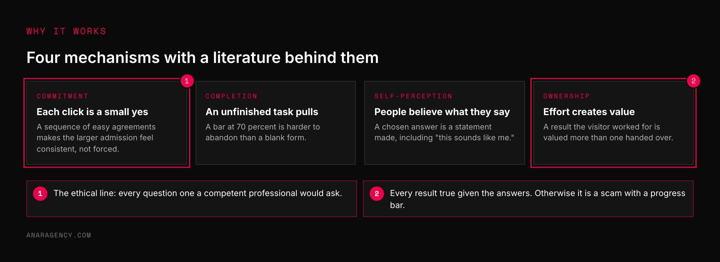
A sequence of small agreements makes a larger one feel consistent instead of forced. That is the foot-in-the-door pattern, studied since the 1960s. People infer their own attitudes from their own behavior, including a click on "this sounds like me."
That is self-perception theory.
And a result the visitor worked for is valued more than one handed over. It is the same effect that makes people overvalue furniture they assembled, the IKEA effect, and its older cousin, the endowment effect.
Put together, the arc produces a visitor who has made a series of statements and now holds a result they contributed to. Walking away from the offer means contradicting their own answers, and people are reluctant to do that. The discomfort has a name too, cognitive dissonance.
The ethical line is simple and we hold it: every question must be one a competent professional would actually ask, and every result must be true given the answers. A quiz that manufactures a problem the visitor does not have is a scam with a progress bar. A quiz that helps a visitor see a problem they do have is a consultation.
This is also why a quiz beats a long page for an audience that has not yet named its problem. A page tells. A quiz asks.
The reader who would bounce from a paragraph about their situation will answer a question about it, because answering is easier than reading and feels like doing something. Interactive formats reduce the load on working memory by revealing one step at a time, a principle the Nielsen Norman Group describes as progressive disclosure.
The result page: bad news, good news, a path
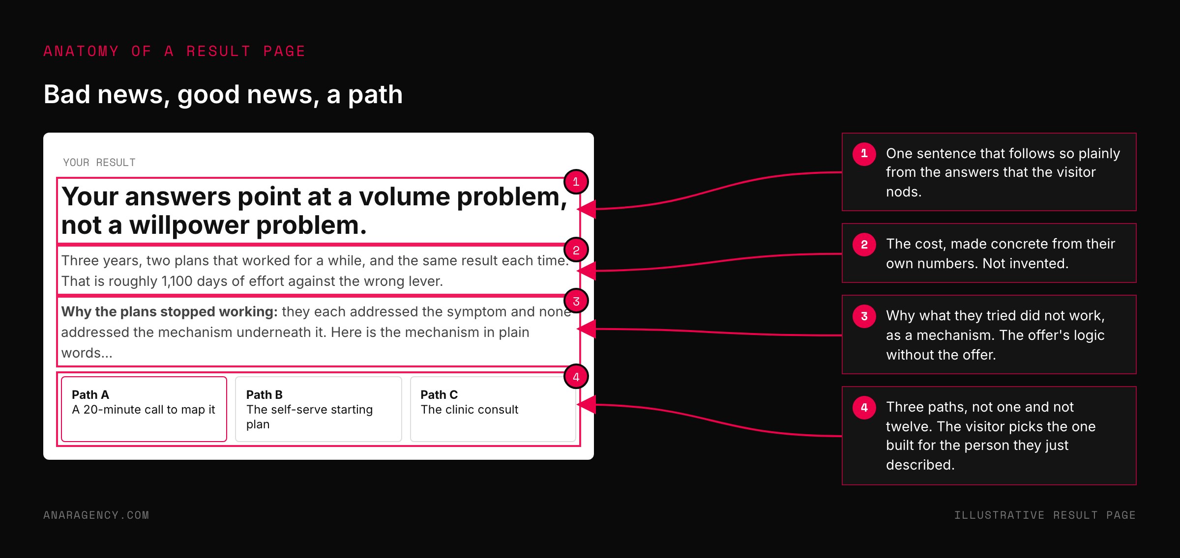
The result page is the sales page, and it has four parts in a fixed order.
First, the honest finding: one sentence that names what the answers add up to, in the visitor's own terms. Second, the cost, made concrete from their answers: months, attempts, dollars, a number they can feel.
Third, why what they tried did not work, stated as a mechanism, which is where the offer's logic enters the page without the offer itself. Fourth, the path that fits this result.
The path is where personalization earns its keep. Three or four paths, not one and not twelve, each matched to a result cluster, each a real next step: a consultation for one group, a self-serve starting point for another, a specific service for a third.
The visitor sees a next step built for the person they just described. That is a different experience from seeing the same button everyone sees.
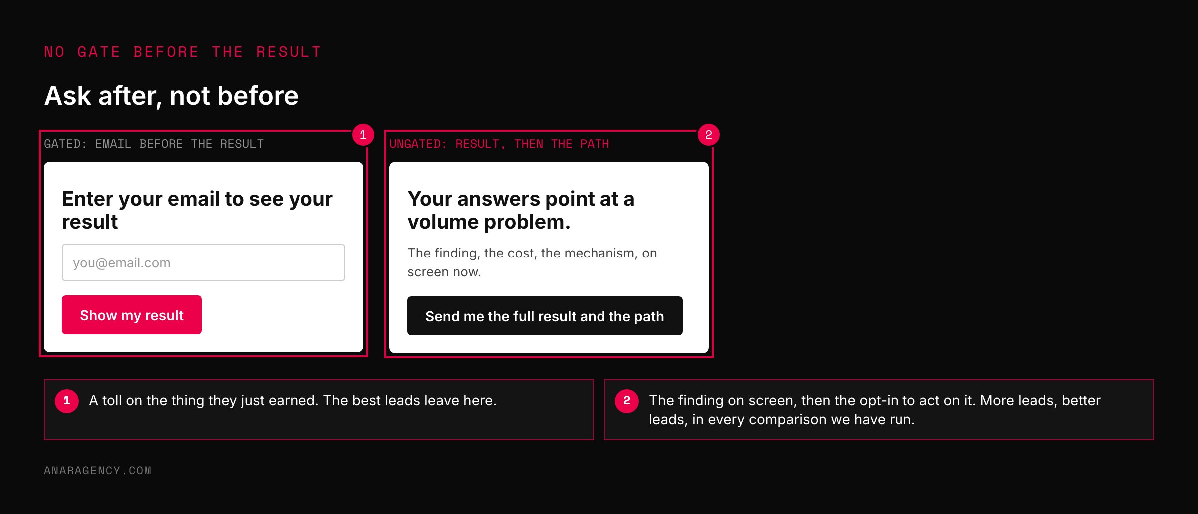
Two rules on the result page. No surprise: the finding has to follow from the answers so plainly that the visitor nods. And no gate before the result: asking for an email to see the result the visitor just worked for breaks the ownership the quiz built.
Ask for the email to send the result, or to start the path, after the result is on screen. In our accounts the ungated result followed by an opt-in to act on it has outperformed the gated result every time we have compared them, and the leads are better because they chose a path instead of paying a toll.
Where the quiz lives: ad, page, platform
A quiz funnel starts in the ad. The ad's job is to ask the first question, or to promise the result, so that the click is already an answer.
"Which of these three is slowing your recovery" is a better cold ad than "take our quiz", because it starts the arc before the page loads. Our article on the Three-Layer Ad covers how a cold ad moves a reader into a problem state, and the quiz is the natural landing for that reader.
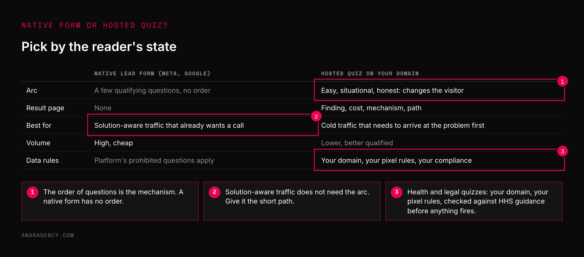
The platform's native forms are not a quiz. Meta's lead ads and Google's lead form assets collect contact details inside the ad with a few qualifying questions, which is excellent for volume and poor for the arc, because there is no result page and no path.
We use native forms for solution-aware traffic that already wants a call, and a hosted quiz for cold traffic that needs to arrive at the problem first.
Keep the quiz on your own domain, on a page with the same visual as the ad, loading fast, one question per screen on mobile. A quiz that takes four seconds to load its first question has already lost the visitor the ad worked to catch.
And Baymard's research on form length is a reminder that every field you add to the contact step at the end costs completions. Two fields and a path choice is enough.
Rules for regulated industries
A quiz collects answers, and answers are data. For a plumber, that is a marketing question. For a clinic, a law firm, or a financial advisor, it is a compliance question, and the quiz has to be built to the stricter rule.
Health-related quizzes in particular can gather information that the Department of Health and Human Services treats as protected when a covered entity collects it. Its guidance on online tracking technologies is the document a medical practice's quiz should be checked against before any pixel fires on the result page.
Every email that follows a quiz opt-in is commercial email, which means the CAN-SPAM rules apply: accurate headers, a physical address, a working unsubscribe honored promptly.
And the result page is advertising, so its claims need the same substantiation any ad does. A result that says "your symptoms indicate" is a medical claim. "People who answered this way often find" is not.
We write result pages to the second standard for every client in a regulated field, and the quiz converts fine.
The test we apply before a quiz goes live is one question: would a licensed professional in this field be comfortable asking these questions and giving these results to a stranger? If yes, build it. If no, the quiz is not a funnel problem.
It is an offer problem, and it goes back to the client.
Questions executives ask
What is a quiz funnel?
A sequence of questions that leads a visitor to a personalized result and a matching next step. The ones that convert well do more than sort: the order of the questions moves the visitor from curiosity to admitting the problem is theirs, so they reach the offer already agreeing with the diagnosis.
How many questions should a quiz funnel have?
Eight to ten. That leaves room for three movements, easy, situational, and personal, without the completion rate falling. Show a progress bar; people are reluctant to abandon a task they have mostly finished.
Should I ask for an email before showing the quiz result?
No. Show the result, then ask for the email to send it or to start the matching path. Gating the result the visitor just worked for breaks the sense of ownership the quiz built. In our accounts the ungated result with an opt-in to act on it has produced more and better leads.
Do quiz funnels work for cold traffic?
They are one of the few formats that do. A cold reader who would not read a long page will answer questions, because answering is easier than reading. The question arc does the persuading that a page would have to do in paragraphs.
Can a medical practice or law firm use a quiz funnel?
Yes, built to the stricter rule. Answers are data, result pages are advertising, and follow-up emails are commercial email. Check health quizzes against HHS guidance on tracking technologies, write results as observations rather than diagnoses, and follow CAN-SPAM on every email.
If a licensed professional would not ask the question, the quiz should not either.

Filip Kovacevic is the founder of Anar Agency in Phoenix. He spent five years running SEO, Meta ads, email, and content for medical practices across the United States, and now does the same work for healthcare, home-service, legal, and professional-service businesses, alongside AI implementation. More from Filip →
Talk it through in 15 minutes
Bring one AI question from this article. We will tell you what we would do, whether or not you hire us.
Book a 15-Min Chat →