The Unasked Questions Every Landing Page Has to Answer
Every visitor to a landing page silently asks six questions, in order: Am I in the right place? Is this for someone like me? What is this, exactly?
Why should I believe you? What will it cost me? What happens when I click?
They never type them, and they leave at the first one the page fails to answer. The first is decided in about a second by whether the page matches the ad. The fifth is the one most pages hide, and the checkout data shows what that costs: surprise charges are the most-cited reason people abandon a purchase.
The conversation you cannot hear
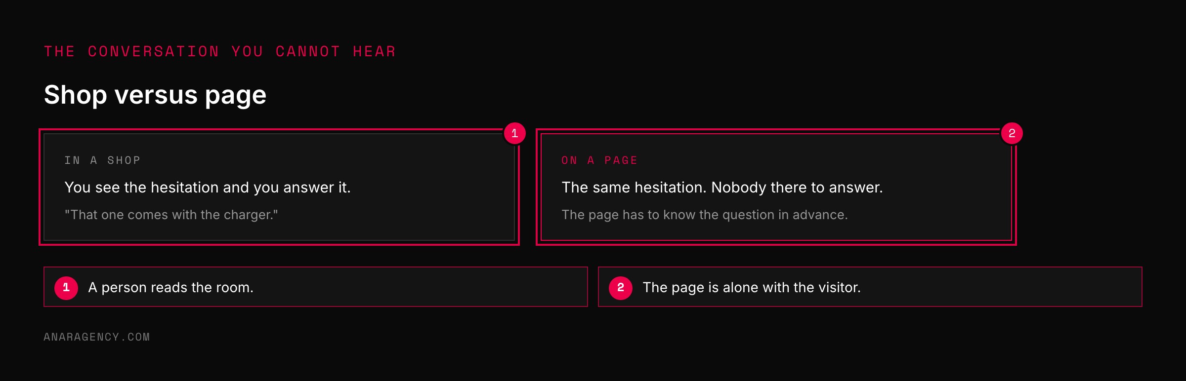
In a shop, you can see a customer hesitate. They pick the thing up, turn it over, look for the price, glance at the door.
So you say something. "That one comes with the charger." And they relax.
On a web page you get none of that. The visitor still has every one of those hesitations. You just cannot see them, and you are not there to answer.
The page has to answer for you. Which means it has to know the questions in advance.
Ten seconds, and the first question
You do not have long. Research from the Nielsen Norman Group found that visitors often leave web pages within 10 to 20 seconds, and that a page has to communicate its value in that window to hold them.
The first question fills that window, and it is not about your product at all. It is: am I in the right place?
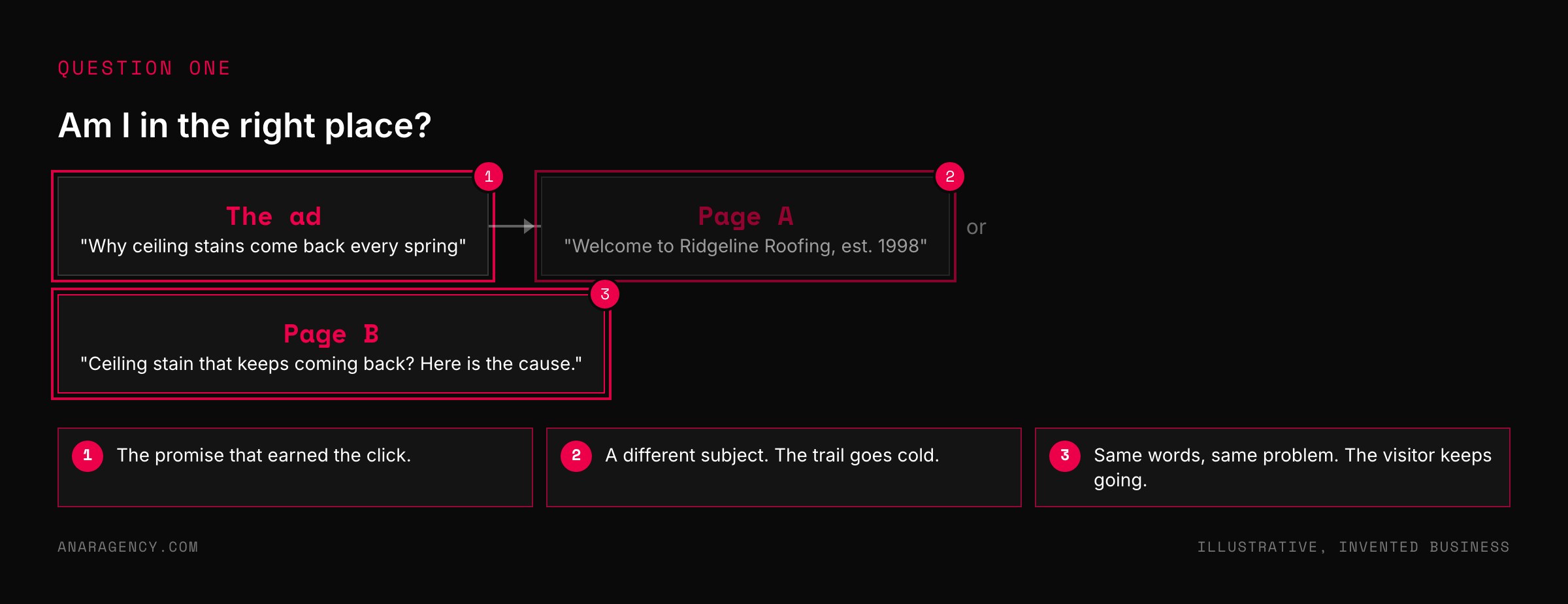
The visitor just clicked something. An ad, a search result, a link in an email. That thing made a promise.
They are checking whether the page keeps it.
Usability researchers call this information scent. People follow a trail of cues toward what they want, and the moment the trail goes cold they turn back.
Think of a road sign that says airport, and then the next sign says train station. You do not keep driving to find out. You assume you took a wrong turn.
Google builds this into what it charges. One part of its Quality Score is landing page experience, which looks at how relevant and useful the page is to people who clicked the ad. A page that does not match costs you twice: once in lost visitors, and again in the price of the click.
Six questions every visitor asks silently, in this order: Am I in the right place? Is this for someone like me? What is this, exactly?
Why should I believe you? What will it cost me, in money, time, effort, and risk? What happens when I click?
Answer each one in that order, briefly, where the visitor is when they ask it. The first is a headline that matches the ad. The fifth must come before the final step, not during it.
The sixth is a line under the button.
The six Unasked Questions
Here they are, in the order a visitor asks them.
One: am I in the right place? Answered by the headline and the picture, in about a second. Use the same words and the same feel as the thing they clicked.
Two: is this for someone like me? A dentist wants to see dentists. A shop with four employees does not want a page about enterprise teams.
Three: what is this, exactly? A service, a course, an app, a phone call. It is startling how many pages never say.
Four: why should I believe you? Proof a stranger can check. Names, numbers, photos, dates.
Five: what will it cost me? Not only money. Time, effort, and what happens if it goes wrong.
Six: what happens when I click? The next screen. Whether someone will call.
How long it takes.
The order matters as much as the answers. A page that opens with proof, before the visitor knows what the thing is, is answering question four to someone still on question one.

Straight Answerers: what the pages that convert do
Some pages convert well with plain design and ordinary copy. They are not better written. They answer the awkward questions.
We call them Straight Answerers.
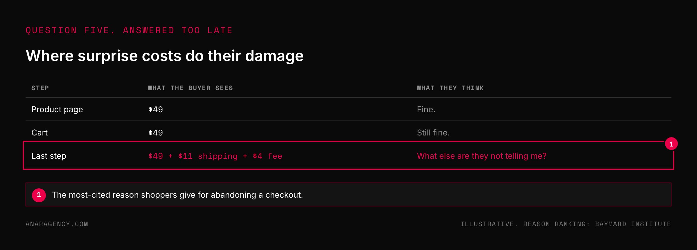
They say the price, or how pricing works. Hiding it does not stop the question. It just lets the visitor imagine the worst answer.
They show the costs before the last step. The Baymard Institute, which collects checkout research, puts the average documented cart abandonment rate at 70.22 percent.
The most-cited reason in its survey of shoppers who abandoned a purchase was extra costs being too high, such as shipping, tax, and fees. Forty percent named it.
Look at what that is. Seven in ten carts are left behind, and the top reason shoppers give is a number that appeared too late. That is question five, answered at the worst possible moment.
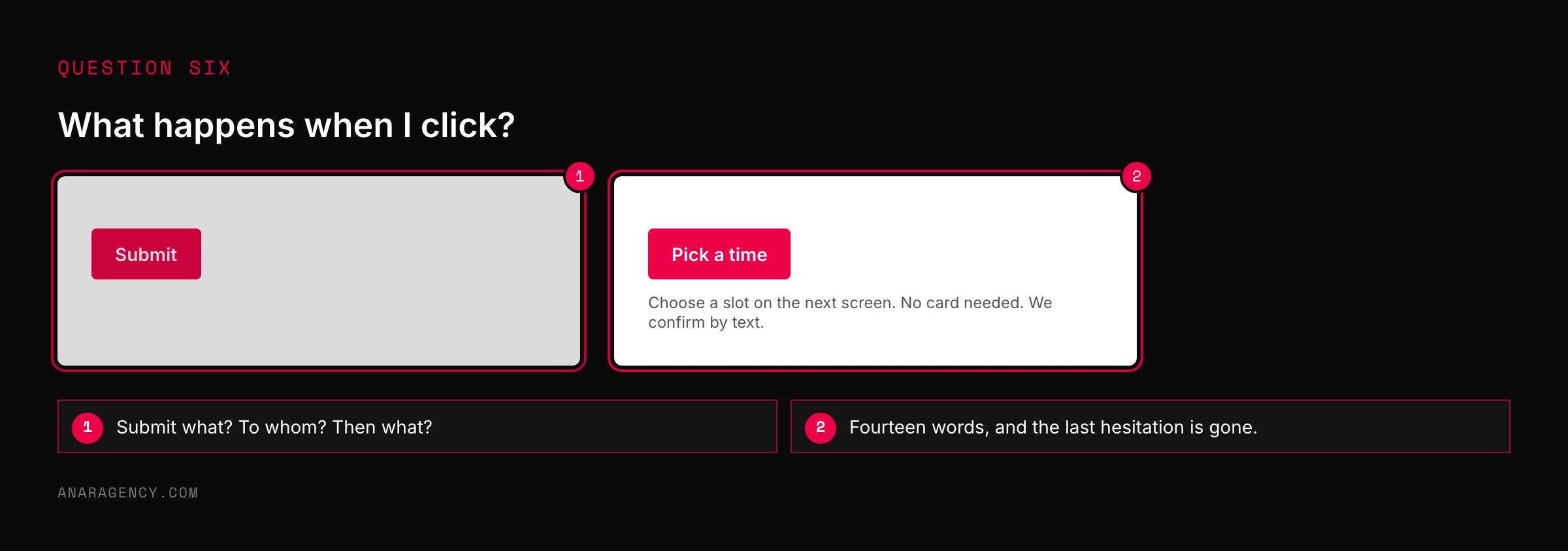
They narrate the click. Under the button: "Pick a time on the next screen. No card needed."
Fourteen words, and question six is gone.
"More information will scare people off."
You may be thinking that if you answer all six, the page gets long and people stop reading. The fear is reasonable. The fix is not to hide answers.
A visitor does not leave because a page is long. They leave because the next thing on it is not the answer to the question they have right now.
So answer in order, and keep each answer short. Question one is a headline. Question three is one sentence.
Question six is a line under a button.
Then check it against real people. A free tool like Microsoft Clarity records how far visitors scroll and where they stop. Where a lot of them stop is usually where a question went unanswered.
And check the join between the ad and the page, because question one is lost there more than anywhere. We go deep on that in ad-to-page alignment.
If you want the same idea applied to a whole account, reading ad data shows which number tells you that a page is losing people.
What to read next, and why
How Long Do Users Stay on Web Pages? (research): The source of the 10 to 20 second window. It will change how you write a headline.
Information Scent (research): Why a visitor turns back the moment the page stops matching what they clicked.
Cart Abandonment Rate Statistics (research collection): The reasons people quit a checkout, ranked. Almost every one is an unanswered question.
About landing page experience (Google Ads Help): How Google judges the page behind your ad, and why a mismatch raises your costs.
So the simple takeaway is this: open your page and ask the six questions out loud, in order. The first one you cannot answer from what is on the screen is where your visitors are leaving.
Questions executives ask
What questions should a landing page answer?
Six, in order: whether the visitor is in the right place, whether this is for someone like them, what the offer actually is, why they should believe you, what it will cost them, and what happens when they click. Visitors leave at the first question the page does not answer.
How long do visitors stay on a landing page?
Often very briefly. Nielsen Norman Group research found visitors commonly leave within 10 to 20 seconds unless the page clearly communicates its value in that time. That window is spent deciding whether the page matches what they clicked.
Why do people abandon checkout?
The Baymard Institute puts the average documented cart abandonment rate at 70.22 percent. The most-cited reason in its survey of shoppers is extra costs being too high, such as shipping, tax, and fees, named by 40 percent. A cost that appears late is a question answered too late.
Should I show prices on my landing page?
Show the price or explain how pricing works. Leaving it out does not remove the question. It lets the visitor assume the worst answer, and it moves the surprise to the last step, where it does the most damage.
What is message match?
It means the landing page uses the same promise, words, and feel as the ad or link the visitor clicked. It answers the first silent question, whether they are in the right place, and Google factors a related measure, landing page experience, into Quality Score.

Filip Kovacevic is the founder of Anar Agency in Phoenix. He spent five years running SEO, Meta ads, email, and content for medical practices across the United States, and now does the same work for healthcare, home-service, legal, and professional-service businesses, alongside AI implementation. More from Filip →
Talk it through in 15 minutes
Bring one AI question from this article. We will tell you what we would do, whether or not you hire us.
Book a 15-Min Chat →