The Long Ad: Why 800-Word Facebook Ads Still Convert
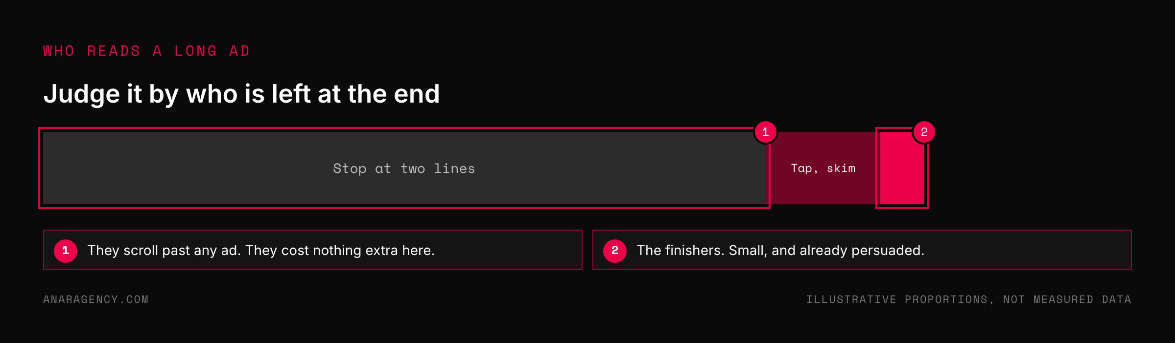
A long ad works because of who finishes it. Most people stop after two lines, which costs you nothing extra. The few who read 800 words have spent three minutes with your argument and arrive at your page already persuaded.
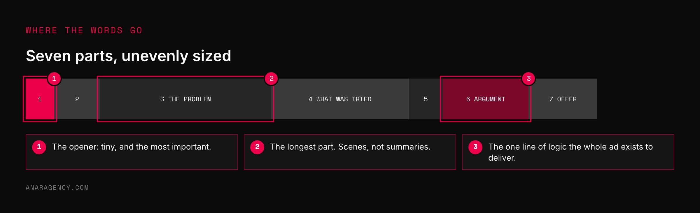
The long ad has seven parts: an opener that works alone, a short setup, the problem, what was tried, the turn, the argument, and the offer with a strong last line. Tell the story in the first or third person, never about the reader, and keep the result brief so the click still has a job to do.
Everybody knows nobody reads
Here is something every marketer is sure of. Attention spans are gone. Nobody reads.
Keep it short.
And yet the ads that sell expensive, considered things on Facebook are often the length of a short magazine piece. Six, seven, eight hundred words under a plain photo.
That looks like a contradiction. It is not.
Nobody reads everything. But a person with a problem that is costing them sleep will read every word about that problem. The long ad is not written for everybody.
It is written for that person.
The oldest trick in the business
The long story ad is about a hundred years old.
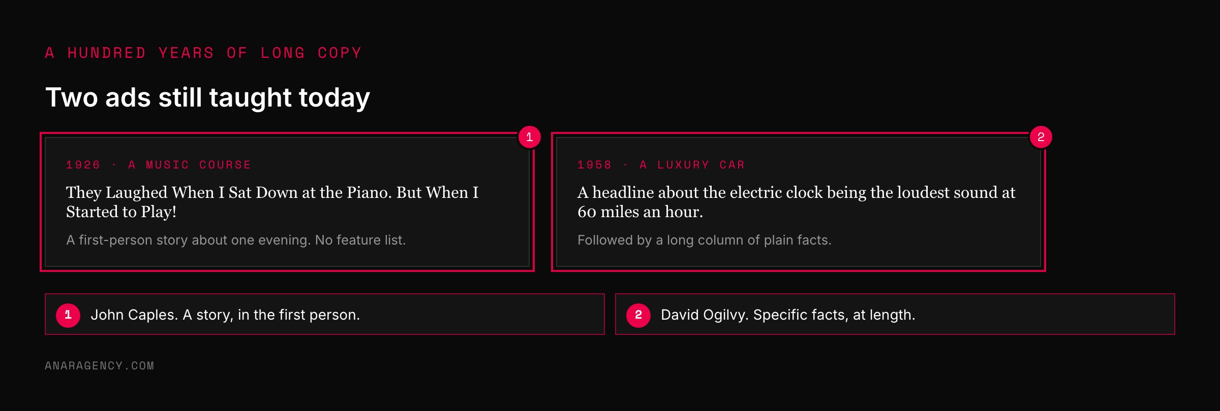
In 1926 a young copywriter named John Caples wrote an ad for a mail-order music course. The headline was "They Laughed When I Sat Down at the Piano. But When I Started to Play!"
What followed was not a list of features. It was a story, told in the first person, about a man at a party who everyone assumed could not play. It ran long.
It became one of the most famous ads ever written.
Thirty years later David Ogilvy wrote an ad for Rolls-Royce with a headline about the loudest sound in the car at 60 miles an hour being the electric clock. Under it was a long column of plain, specific facts.
Neither man was guessing. Both were known for testing what sold.
Psychologists have a name for what a good story does to a reader. They call it narrative transportation: a person absorbed in a story stops arguing with it. That is the state a long ad is built to create.
Seven parts. One: an opener of two lines that works alone. Two: a short setup that says who this is for and why a story is coming.
Three: the problem, in specific scenes, told in the first or third person. Four: what was tried and failed. Five: the turn, brief.
Six: the argument, one line of logic showing they were fixing the wrong thing. Seven: the offer, the cost of doing nothing, and one last line. Give the most room to parts three and four and keep the result short.
Use it for considered purchases.
Finishers: who a long ad is really for
The mistake is judging a long ad by how many people read it. Judge it by who is left at the end. We call them Finishers.
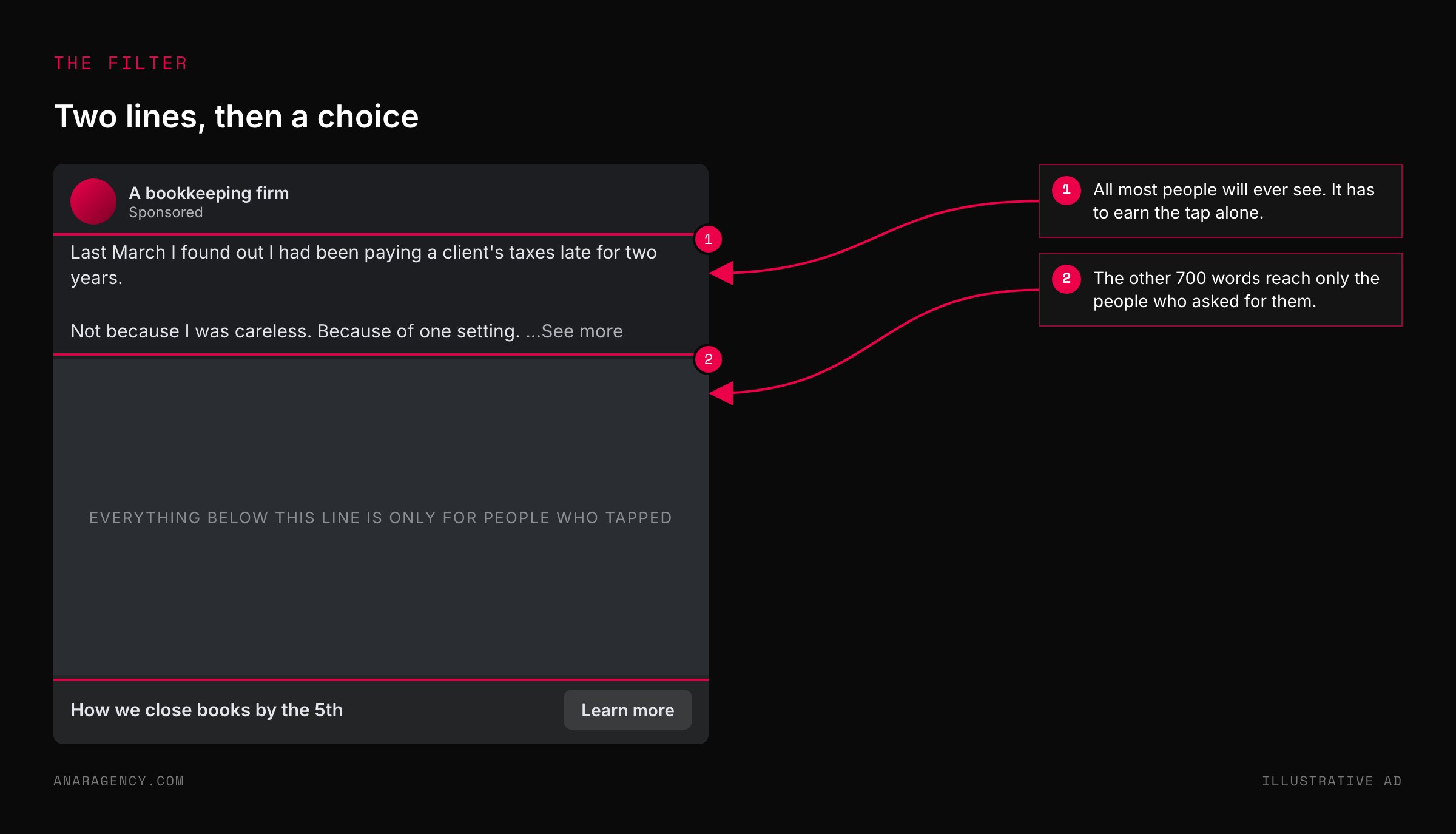
Finishers have already been filtered. In a feed, the ad shows two lines and a "see more" link. Someone who taps that, and then reads for three minutes, has told you something no targeting setting can.
Finishers arrive persuaded. A short ad sends a curious stranger to your page and asks the page to do all the convincing. A long ad does much of it before the click.
Finishers cost nothing extra to find. The people who stop at line two were never going to buy. Their scroll past costs the same as it would on a short ad.
This is why length suits some offers and not others. A $40 impulse buy does not need three minutes of reading. A $4,000 service that someone will think about for a week does.
We do not have a house statistic that long beats short, and we would distrust anyone who gave you one. What we can say is what the format is for: a considered purchase, and a reader with a real problem.
The seven parts
A long ad is not a short ad with more words. It has a shape.
The opener is two lines that work alone. The setup says who this is for and why a story is coming. A stranger who starts telling you a story at a bus stop is odd.
A stranger who says "you look lost, I had the same problem last year" has earned the next minute.
The problem is the longest part, told in scenes. Not "I was stressed." The Sunday night with the spreadsheet open and the phone face down.
What was tried comes next: the fixes that did not work. This is where the reader recognizes their own last two years.
The turn is short. Something changed. The argument explains why, in one line of logic.
You thought the problem was one thing, so you kept doing the usual fix. The real problem was something else, and the usual fix made it worse.
That line is the center of the ad. It does something kind for the reader. It tells them their past failures made sense, because they were fixing the wrong thing.
The offer and the last line close it. Say what you sell and why. Say what happens if nothing changes.
Keep the happy ending short, so the click still has something to deliver. Then end on one sentence worth remembering.
"Should the story not be about the customer?"
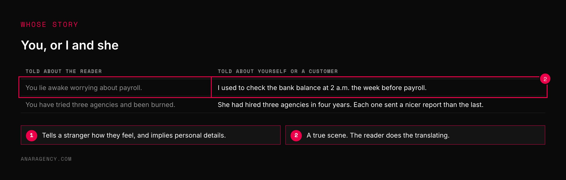
You may have been taught to write "you" in every line. In a long ad on Meta, that instinct will hurt you twice.
First, the policy. Meta does not allow ads that assert or imply personal attributes of the viewer, and its examples include health conditions and financial status. A 600-word story that says "you lie awake worrying about your debt" walks straight into that rule.
Second, the feeling. A story about "you" tells the reader how they feel, and people do not like being told that by a stranger. A story about "I" or "she" lets them decide for themselves that it sounds familiar.
So tell it about yourself, or about a customer with their permission. The reader will do the translating, and they will trust the conclusion more because they reached it.
One more rule: every scene has to be true. A long ad is persuasive because it is specific, and invented specifics are the fastest way to lose a reader who knows the territory.
Which opening line to use for which reader is its own subject. We cover it in before-words and after-words.
What to read next, and why
John Caples (encyclopedia entry): The man behind the piano ad, and a lifetime of testing what made ads work.
Narrative transportation (encyclopedia entry): The research on why a reader inside a story lowers their guard. Useful for understanding what the long ad is actually doing.
Meta's Personal Attributes advertising policy (policy): Read it before you write a single scene. It decides whose story you can tell.
Meta's ads guide for the Facebook feed (specifications): Where the text gets cut off. Your opener has to live above that line.
So the simple takeaway is this: a long ad is not for the people who skip it. Write two lines that earn the tap, and then tell the true story of the problem to the few who stay.
Questions executives ask
Do long Facebook ads work?
They suit considered purchases. Most people stop after the first two lines, which is true of any ad. The few who read a long ad to the end have spent minutes with your argument and reach your page already persuaded.
For low-priced impulse buys, short copy is usually enough.
How long should Facebook ad copy be?
As long as the decision needs. A small, simple purchase needs a few lines. An expensive service that someone will think about for days can justify several hundred words, as long as the first two lines work alone, because that is all most people see before tapping to read more.
What is the structure of a long-form ad?
Seven parts: an opener, a short setup, the problem told as a story, what was tried and failed, the turn, the argument explaining why the old fixes failed, and the offer with a strong last line. The problem and the failed fixes take the most space.
Should ad copy use "you" or tell a story about someone else?
For a long story ad on Meta, tell it in the first or third person. Meta's policy prohibits ads that assert or imply personal attributes of the viewer, such as health or financial status, and readers accept a conclusion more readily when they reach it themselves.
What was the "They Laughed When I Sat Down at the Piano" ad?
A 1926 mail-order ad for a music course written by John Caples. It told a first-person story about a man surprising his friends at a party, and it is one of the best-known examples of a long story-led advertisement.

Filip Kovacevic is the founder of Anar Agency in Phoenix. He spent five years running SEO, Meta ads, email, and content for medical practices across the United States, and now does the same work for healthcare, home-service, legal, and professional-service businesses, alongside AI implementation. More from Filip →
Talk it through in 15 minutes
Bring one AI question from this article. We will tell you what we would do, whether or not you hire us.
Book a 15-Min Chat →